Think about the last time you had to make a big decision. Did you rely on your gut, or did you turn to data to guide you? In today’s fast-paced business world, decisions need to be quick, informed, and impactful. That’s why Data Visualization is no longer a nice-to-have—it’s a must-have. It transforms raw numbers into stories, making it easier to understand and act on what really matters.
Why Businesses of All Sizes Need Data Visualization
1. Seeing the Big Picture, Faster
Imagine you’re running multiple stores across the country. A simple chart can instantly show which locations are thriving and which need attention. No need to dig through endless spreadsheets—just a quick glance, and you’re ready to act.

2. Breaking Down Barriers
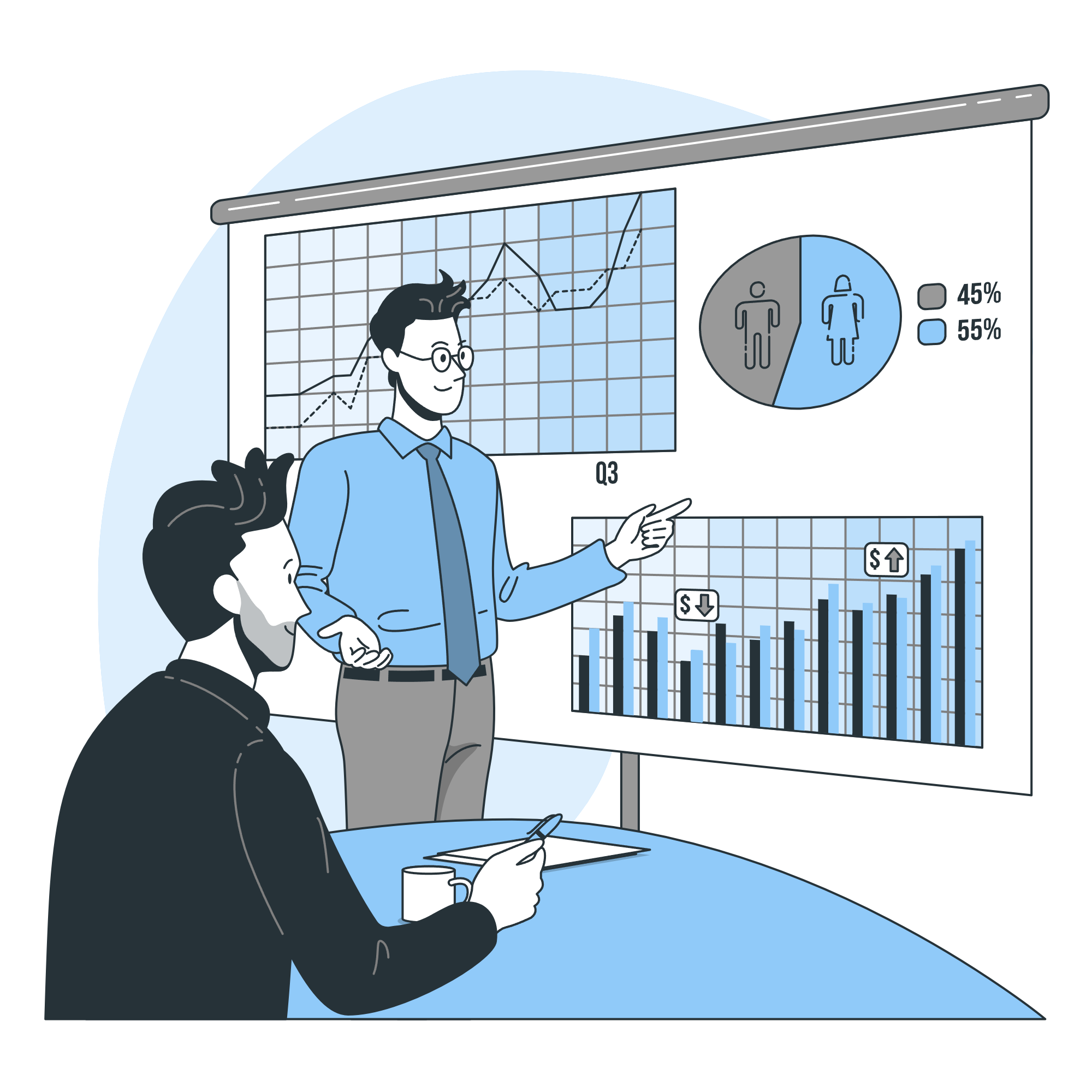
Not everyone speaks the language of data. That’s where visuals come in. A pie chart can explain marketing results to your CEO in seconds, and a dashboard can help your team see exactly where to focus their energy.
3. Spotting Trends Before They Happen
From predicting seasonal dips to identifying customer preferences, good visualizations help you stay ahead of the curve. For instance, an online store can use heatmaps to see which products attract the most attention, making it easier to plan promotions and stock inventory.

Real-Life Examples of Data Visualization in Action
- In Marketing: Marketers love heatmaps. They reveal where users are clicking, scrolling, or dropping off. This helps fine-tune campaigns and improve website performance.
- In Finance: Visual dashboards make tracking profits, expenses, and cash flow a breeze. Instead of combing through reports, you can quickly spot patterns, like recurring revenue dips, and adjust accordingly.
- In Operations: When supply chains get messy, visual tools like flow diagrams help pinpoint bottlenecks. Fixing these issues saves time and money.
- In Human Resources: Word clouds or survey charts can reveal employee sentiment. Patterns like recurring mentions of “work-life balance” can guide HR initiatives.
- In Customer Service: Sentiment analysis charts break down feedback so you can respond more effectively.
How to Get the Most Out of Data Visualization
- Think About Your Audience: Keep it simple for non-experts and detailed for analysts.
- Choose Wisely: Use the right chart for the job. Bar charts for comparisons, line graphs for trends, and pie charts for proportions.
- Stay Focused: Don’t overload visuals with too much info. Highlight the key points.
Turning Insights into Impact
The best visualizations don’t just show data; they tell a story. Imagine guiding your team through a presentation where each slide builds on the last, showing problems, solutions, and results. It’s not just informative—it’s memorable.
How VdoAnalytics Can Help
At VdoAnalytics, we specialize in helping businesses make sense of their data. Whether you’re a small startup or a large enterprise, we’ll turn your raw numbers into clear, actionable visuals. Let us help you turn insights into decisions that drive success.
